Beyond vibe coding: give vibes to your designs
I did not design the UI for my bench instrument. I prompted, Claude offered variants, I picked one and said what was wrong with it. Selection is a different job to specification, and it needs far less of me.
0 views
The analyzer is one of the key screens in PowerBench AI’s user interface, running on an old Android tablet. Apart from the traces in a realtime scrolling view — voltage and current here, power too when you want it — it also surfaces the realtime properties of the instrument.
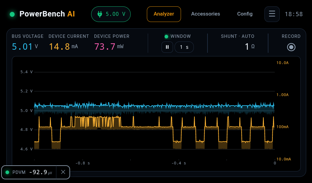
I did not design it. I could not have. I do not have the vocabulary to write a brief that would produce this, and if you had sat me down in front of a blank file and asked for a professional instrument UI, I would have produced something that looked like a spreadsheet with a graph in it.
What I did was run a loop. I prompt, Claude comes back with options, I pick one and say what needs to change in it, it builds. Four steps, repeated for weeks. Claude follows your app design language to the dot. And converting the design to a feature becomes trivial for Claude. And best part, you get all behavioural test cases from first run and each run part of CI every time the gate runs.
Design is a process, not a prompt
Vibe coding is a single pass. You describe what you want, something appears, you accept it or you do not. Ask it for a screen and you get a screen. Ask it for the next screen and you get another one, made by a process that has forgotten the first. Nothing accumulates.
Design has never worked that way. It has rounds because you cannot judge a thing in isolation — you need the dense version beside the spacious one before you know which one your instrument wants to be. And it produces something more durable than the screens themselves: a design language. The palette, the spacing steps, the type scale, what each colour is allowed to mean, how a card is put together, what a control does when it is disabled or degraded or being driven remotely.
That language is the real artefact. It is written down, it is a small file, and it is what makes every later screen cheap. Amber means a heading, an active selection, or the hero trace, and it never touches body text. Violet is for event markers and is never the red that means an error. Numerals are mono and tabular so a digit changing does not shift the column. None of those are decisions about the analyzer screen. They are decisions about every screen, made once.
So the loop is not three rounds of picking a nicer-looking mockup. Each round settles part of the language, and the screens fall out of it. That is why the process converges instead of wandering — and it is why the next set of screens took a fraction of the effort the first one did.
What changed is not that the model writes the CSS. It is that it will run the rounds, hold the language across all of them, and apply it to the dot.
Three directions I did not think of
Round one of this UI was three complete directions, rendered and running on the actual tablet. A dense one, laid out like a bench instrument’s SCPI front panel. A spacious one that behaved like an appliance. And a hybrid — spacious card chrome with dense mono numeric zones inside it.
I picked the hybrid. That took me about a minute, and it required no design skill whatsoever. Looking at three things and knowing which one belongs on a piece of test equipment is a judgement I already had, because I have used test equipment for many years.
Producing the three was the hard part, and I had no hand in it. I did not ask for a dense variant and a spacious variant. I asked for options. The axis they vary along — density — was chosen by the thing making them, and it happens to be exactly the axis that matters for an instrument. That is a design decision, made before any of the pixels existed, and it is the decision I would have got wrong.
But the directions are the obvious part. What I did not expect was how much subtlety arrived in the first draft, in decisions I had not thought to have an opinion about.
The current trace is the one that stopped me. I had imagined it as a line — that is what a trace is, a line moving across a screen. All three mockups drew it as an envelope: a filled band between the minimum and maximum of everything that happened inside each pixel column, with the maximum picked out as a brighter outline on top.
That is the correct way to draw it, and the reason is physics rather than taste. The instrument samples far faster than the panel can draw. A line has to throw away almost every sample to exist, which means a current spike lasting fifty microseconds simply is not there — the very event you bought the instrument to catch. The band keeps it. You can see it in the screenshot above: the burst structure in the orange trace is a real spread between minimum and maximum, not a line wobbling.
Nobody told it that. I did not write “preserve transients under decimation” in a brief, because I did not know that was a thing I would need. It came out of the first draft, already reasoned through — the band’s fill and its outline were separate tokens in the palette before there was a palette to speak of.
And it did not stay in the UI. Drawing an envelope means the device has to send one, so the wire format carries minimum and maximum pairs rather than raw samples, and the firmware folds them on the way out. A decision that looked like a rendering style on a mockup reached all the way down into the microcontroller. I have spent weeks since then optimising that fold. It exists because a design draft assumed it.
The palette that failed on glass
The second round refined the hybrid into full screens with every component state drawn out. Then it broke.
The palette that looked correct on a desktop monitor read washed out on the physical panel. The panel lifts its blacks and desaturates, so a carefully chosen dark grey became a flat murk and the accents lost their bite. My contribution here was three words to the effect of this looks wrong on the tablet — which is not design feedback, it is just a fact I could see and Claude could not.
What came back was three candidate palettes and a live theme toggle to switch between them on the device. I sat with the tablet, flipped between them, and picked the one that survived. It is now the root of the stylesheet: true black, maximum-saturation accents, hard borders. There is a rule written down that any new colour has to be looked at on the physical panel before it is adopted, because renders and screencaps lie about how that panel behaves.
I did not know that rule before this project. It came out of the loop, and then it got written into the spec so the loop would not have to rediscover it.
Where my half actually is
Look at what my side of those four steps consists of. Pick the hybrid. Say the palette looks wrong. Say a button is too small to hit with a thumb while you are holding a probe in the other hand. None of that is design work. All of it is knowing what a bench instrument has to survive, which is the thing I brought and the thing that could not be prompted for.
The asymmetry is the whole story. Generating a real option space — three directions that genuinely differ along the axis that matters, each one built far enough that you can put it on the hardware and look at it — is expensive and skilled. Choosing between them takes a minute and needs no vocabulary. The expensive half is the half I got for free.
And it only works because the options are real. Three mockups I can run on the panel are worth more than thirty described in prose, because the panel is where the palette failed and no amount of describing would have caught that. The loop needs artefacts at every turn, not proposals.
The verdict
Is this a perfect design? Almost certainly not. Would a professional designer make it better? Absolutely — and it would not be close. There are conventions I do not know I am breaking and a coherence a trained eye would bring that I cannot see the absence of.
That is not the question I am answering, though. The questions that matter for a bench instrument are narrower. Is it usable. Is it intuitive. Does it do the one job it has to do, which is to show you what the current did while you were not looking. On those it passes with flying colours.
For calibration: I own instruments that cost several times what I am building, and their interfaces are primitive. Those were designed by teams with budgets, and the bar they set is low enough that clearing it is not the achievement it sounds like.
Which is the useful version of this claim. Not that a model designs like a professional — it does not. It is that the floor has moved. A weekend project now starts above the level a lot of shipped commercial hardware ends at, and the gap between what I could design and what I could recognise as good is no longer the thing that decides how the product looks.
What I would tell someone starting
Stop writing better prompts. That is the vibe coding instinct — if the one shot came back wrong, describe it harder. It does not scale, because the gap is not in your description, it is in your not knowing what you could have asked for.
Ask for options instead, and insist they be built rather than described. Then spend your effort on the part you are actually qualified for: looking at the thing on the real hardware and saying which one is wrong, and why. You will find that you know far more about that than you thought, and far less about the other half than you feared you needed to.
I have shipped a UI I could not have designed. What I could do was recognise it when it was put in front of me, three at a time.